Peter Mahnke
on 22 March 2022
The Web and design team at Canonical run two-week iterations building and maintaining all of the Canonical websites and product web interfaces. Here are some of the highlights of our completed work from this iteration.
Web
The Web team develops and maintains most of Canonical’s sites like ubuntu.com, canonical.com and more.
In this iteration, we’ve been busy working on a number of projects including banners to support Canonical’s presence at Mobile World Congress 2022.

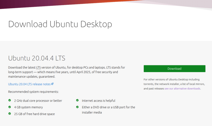
The new point release for Ubuntu 20.04.4 was released. Head over to Ubuntu downloads to find downloads for desktop, server and the Raspberry Pi editions of the server.
Commercial
Commercial squad build and maintain all our shops and purchasing UIs, including the Ubuntu Advantage store.
Machine Activity has been exposed to all users in the Ubuntu Advantage dashboard.
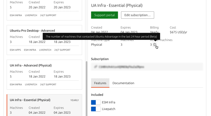
The UA-Client software will contact Ubuntu Advantage using a token that allows us to count the number of active machines in the last 24 hour period. This way our customers can see if they are under or over-using the services and adjust their subscription accordingly.
Apps
The Apps team develops the UI for the MAAS project and the JAAS dashboard for the Juju project.
MAAS
Machine list performance research
An important improvement for MAAS users with large environments is their initial access to arguably the most important section of MAAS, the “Machines” tab. For example, in an environment with around 1,500 machines, it can take a long time to fetch the entire list of machines, blocking the users from starting searching and working.
To improve the experience, the MAAS team decided to identify different areas to investigate:
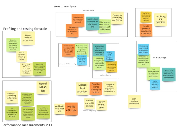
We identified areas of improvement for both the core MAAS system and the in the front-end application.
From the UX side, we focused on the user journey, tried to identify patterns in how the users deal with long lists and opportunities to improve the user’s experience.


We identified two major areas of focus: the time in which users have to wait for the machines to load, and the time they have to find one or several machines within hundreds. This requires us to observe how users deal with such an environment with many machines.
In an attempt to discover this, we contacted several users and opened a poll on Discourse to gather information about what are the most common first actions.

The results showed some clear favourites. If we aggregate the results considering only the machine data they care about (no matter if they search or filter, just by what), we can see three key machine data:
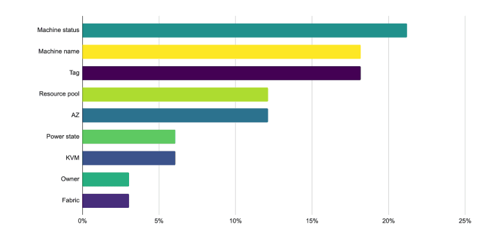
Machine state, machine name and the tags applied to them are our users’ favourite data to search and filter by. This is important if we want to progressively fetch data.
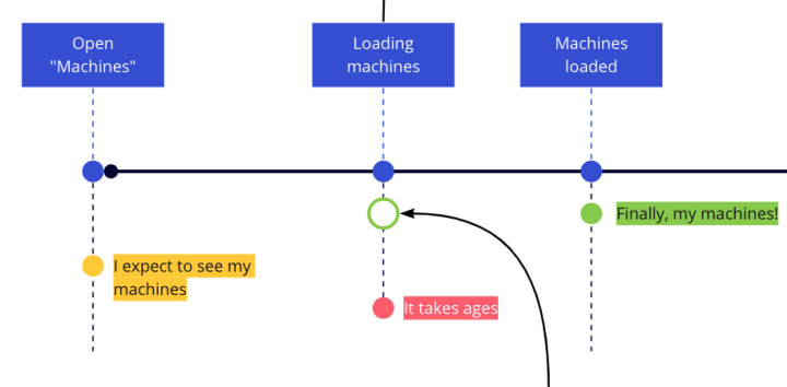
In conclusion, even if we manage to architect a solution to fetch hundreds of machines in a second, users should not have to wait. We probably need to focus on that very first challenge and find ways to allow our users to search and filter even if the entire list is not loaded yet.
Vanilla
The Vanilla team designs and maintains the design system and Vanilla framework library. They ensure a consistent style throughout web assets.
Live demo box sprint
In this iteration, we’ve been joined by Min, Morgan and Carlos who worked with Beth on a prototype of a new Live demo box that is going to replace the existing static embedded examples in Vanilla docs.
We worked on a proof of concept, converting the old code example section of the docs into a more interactive demo box. Allowing users to select all the different options for each pattern and visually see the result. Accompanied with different code examples. The visible example updates depending on the selections, along with the example code snippet underneath.
We started off working on the Notification ‘toast’ variant initially and then refactored it to make the demo box more generic and so able to work with any component. Below demonstrates the code snippet.

Data visualisations sprint
The scope of this work was to research and agree on a draft for data visualisation specifications, in order to derive consistent design solutions across all our products in the long term.
We’ve done some internal benchmarking to find all the graphs and charts we use across all our products. Then classified by type and use cases.

We’ve also done some external benchmarking to compare the data visualisation principles from data visualisation renowned experts and from other design systems while keeping accessibility in mind.

We dug into colour accessibility and are working on a colour palette, containing accessible alternatives.
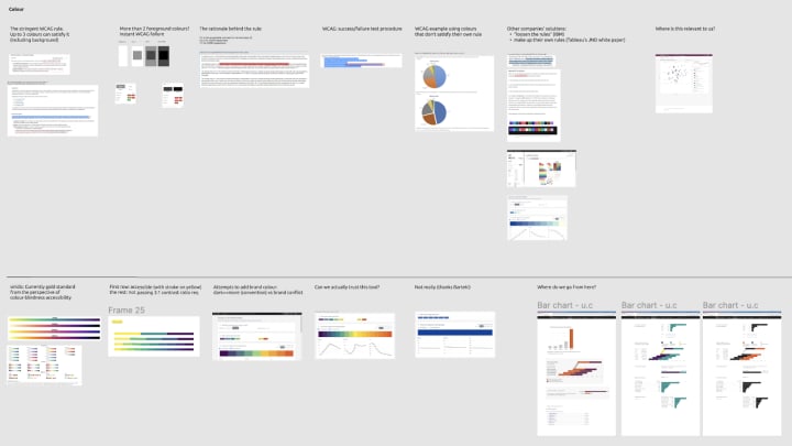
This resulted in a document reporting the main data visualisation guidelines with links to specific chart types specifications and resources.
All the content will be filled in each section as the next following step.
Marketplace
The Marketplace team works closely with the Store team to develop and maintain the Snap Store site and the Charmhub site.
Charmhub
Integrations tab
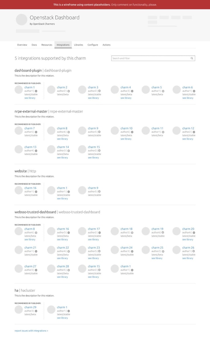
This tab will be available on the charm’s detail page and will list the integrations/relations supported by a charm. This will allow users to explore and discover compatible charms they can connect to that specific charm.
We have been working on wireframes and presenting them to stakeholders, collecting feedback and then iterating on those wireframes. After a few rounds of wireframes, we are now ready to share this proposal with a wider audience. We have posted the current work on Discourse. We are asking for feedback from the community.
Snapcraft
Update metadata on release
Snaps contain a YAML file containing their metadata. By default, the metadata on the snaps listing page is populated automatically from this file. There is now an option to disable that manually, and it will also be disabled automatically if the metadata is updated within the snaps settings page.
Temporary views for publishers and reviewers in the brand store
As we are yet to build pages for publishers and reviewers in our brand store we are adding two temporary views which give the user links to where they can manage their snaps in the current dashboard.
Release UI
Work on the snap release UI continues and the final stages of the design have now been built. Pending review they are expected to be live by next week.
We are hiring!
With ♥ from Canonical web team.


